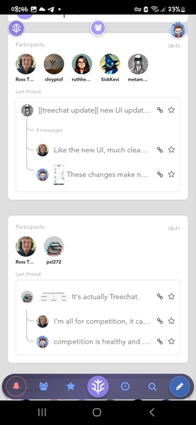
[[treechat update]] new UI update out, lots of small change…
[[treechat update]] new UI update out, lots of small changes to make things clearer and more explicit... I'll do a quick video on the changes soon but I hope you like it, and happy to hear feedback both good and critiques
Replies
reload app for latest
one big change: to see which stream any of the panels contain look towards the top, as you scroll an icon will appear to let you know "where you are" if the panel contains a thread, there will be two icons - the stream's and the thread author's avatar
eg
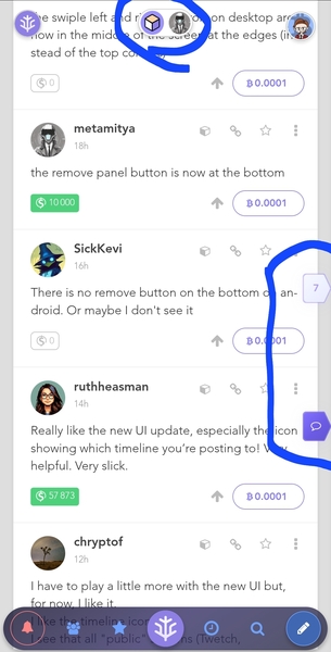
the swiple left and right controls on desktop are now in the middle of the screen at the edges (instead of the top corners)
the remove panel button is now at the bottom
There is no remove button on the bottom on android. Or maybe I don't see it
Really like the new UI update, especially the icon showing which timeline you’re posting to! Very helpful. Very slick.
I have to play a little more with the new UI but, for now, I like it.
I like the timeline icon.
I see that all "public" streams (Twetch, HodlLocker) are now top level instead of in a tree.
I found the new close panel button at the bottom but wonder what is the new small downwards arrow doing? It seems to open another panel. Not sure.
And it seems that someone always needs to have at least one stream open.
Before someone could have screen with only buttons.
Like the new UI, much cleaner, like the message icons showing the replies to threads. Couldn't easily find the close stream button until I saw your message saying where it was.
These changes make navigating sooo much easier. Gg guys.
sidenote - my bsv is still unconfirmed, other than that this site has me hooked atm. I don't even check twitter that much anymore, straight to Treechat
and I like the people tab where I can see a thread and whose in the thread. that's cool as fuck ☕️